2019
![]()
2018
![]()
2017

2016

2015
![]()
2014
2013
Logo IESO 2013
![]()
The logo for the 7th International Earth Science Olympiad has:
Number 7 (representing the 7th edition of IESO)
The Earth’s imagery from space (signifying Astronomy)
The clouds and oceans in the imagery (representing Atmosphere and Hydrosphere)
The Earth’s cross section in number 7 (representing Geoshpere)
The national flag of India, the host country, in number 7.
The slogan Vasudhaiva Kutumbakam
(from ancient scriptures; MahaUpanishad VI.71-73). It means, “The Earth is indeed one family”, which is what IGEO has been striving to achieve: integration of the Earth’s subsystems in the school curriculum.
Designed by R. Shankar and Shwetha B. Shetty, Mangalore University
2012
![]()
The idea with the logo is to put together the different Earth Systems of present day Science with the old native symbolism of Mother Earth.
2011
The logo chosen means to represent the main IESO topics. The marble column symbolizes the connection between art and Earth Science. The theme of this edition is the Earth Science Renaissance. Italy is famous for the Renaissance, a cultural movement that grew in Tuscany, Florence, and then spread all over Europe. It was an important time of intellectual transformation and widespread of educational reform. Even Earth Sciences need a renewal to grow their importance all around the world as it is happening with the International Year of Planet Earth. Renaissance age is famous all over the world especially as far as arts are concerned. There are strong connections between Earth science and art, a lot of Earth Science Departments are starting to collaborate with archaeologist colleagues to study the archaeological site, examine the materials used in building, decoration, monuments. There are Earth scientists dealing with investigating the quarry used in the past, studying the mineral inside clay and stone. Weathering affects monuments and buildings as the rocks in the natural environment. This is just to give some examples.
In Italy there is a huge artistic and cultural heritage. Analysing the link between art, environment and Earth Science is a new approach never used before, that could show and focus on new aspects of Earth science.
2010
2009
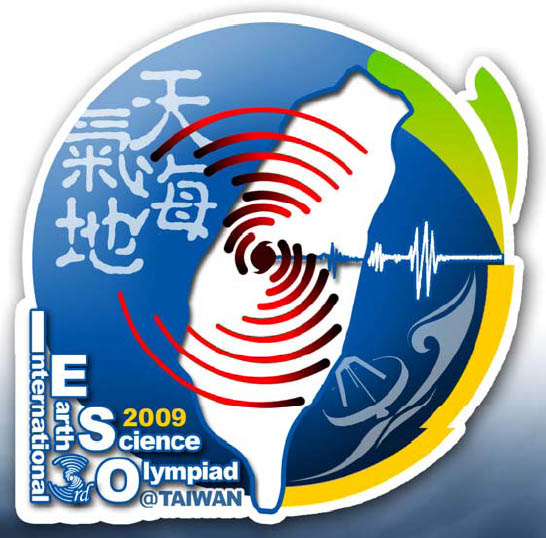
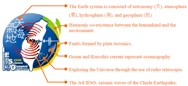
The rationale behind the design of our IESO 2009 logo is to use the different symbols to represent the various areas in the field of Earth Science. For instance, radio telescope represents astronomy, fault formed by tectonic movements, and seismic waves represent Geology, ocean and Kuroshio current represent Oceanology and the red rotation is a symbol of a typhoon which represents Atmosphere. Taiwan is situated in a very unique geographical location which is constantly under the influence of the interaction between Kuroshio current, typhoons and earthquakes. Sitting in an area of seismic belt, the convergence between the Eurasian Plate and the Philippine Sea Plate, Taiwan is in one of the most earthquake-prone areas in the world. An example of the most catastrophic earthquake that ever struck Taiwan would be the Chichi Earthquake which occurred on September 21, 1999 with a magnitude of 7.3. It is marked as the largest as well as the most disastrous earthquake in Taiwan’s recent history. Taiwan’s hosting of the Third International Earth Science Olympiad in 2009 coincides with the 10th anniversary of the 921 Chichi Earthquake. This not only symbolizes the interdependence and mutual support of mankind to overcome the forces of nature when confronted with natural calamities but also remark on the interaction between the environment and humankind.
2008
2007